 Chalk Creative Partners
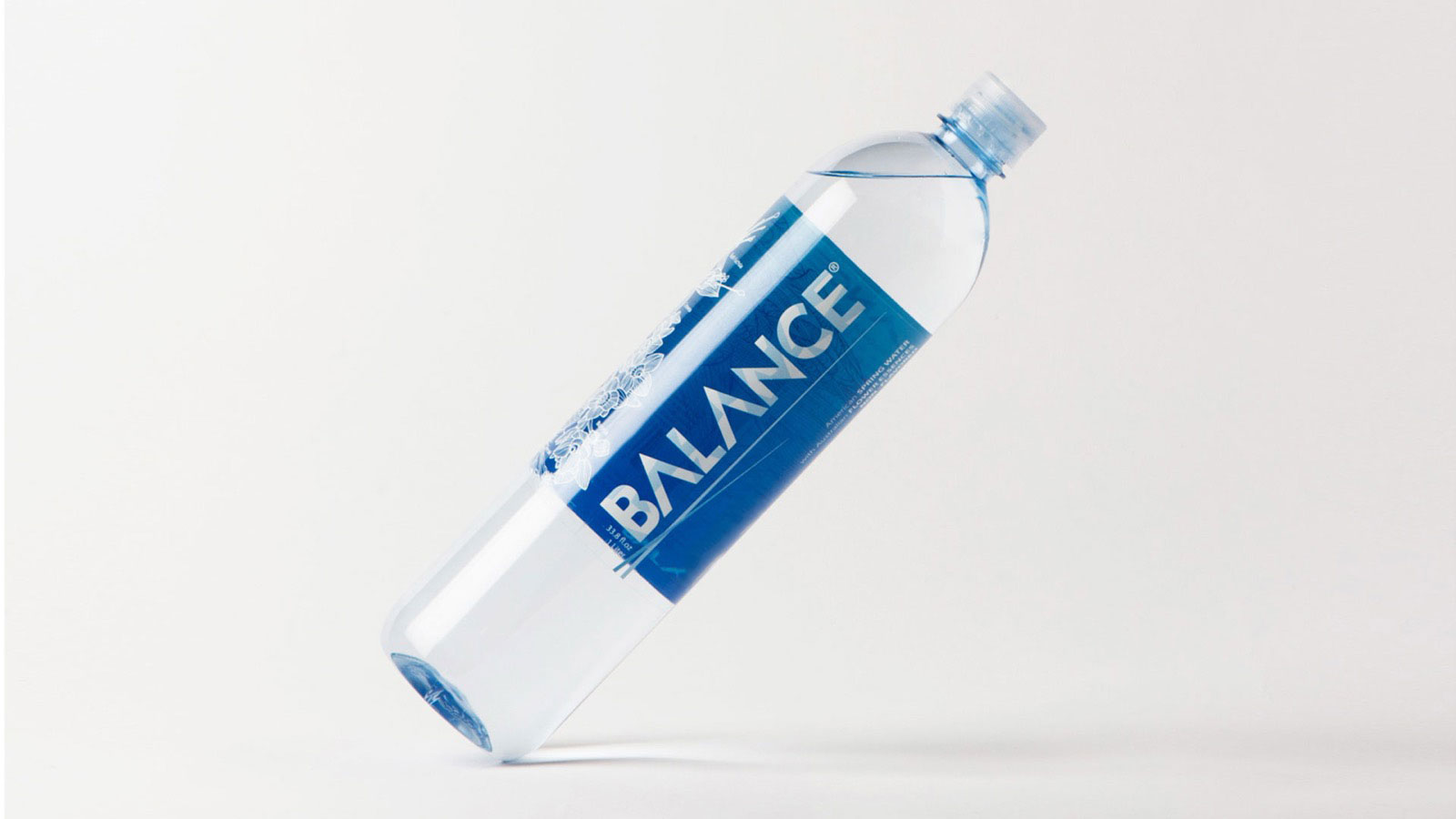
Balance
Re-brand the existing product to give it stand-out shelf presence and highlight the botanical infusions. Develop two new product lines — cans and liquid enhancers.
- Re-brand
- Packaging
- Product lines
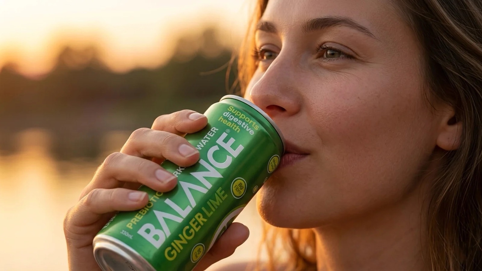
Balance Prebiotic
Label design and packaging for a prebiotic sparkling drink in three flavors — Lemon, Tangerine and Ginger Lime — from single cans to 4-packs.
- Branding
- Packaging
- Art direction
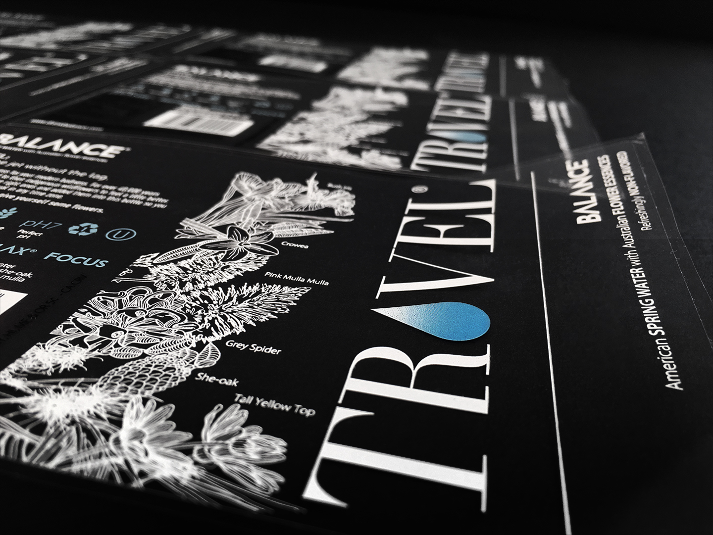
Travel
Product identity tor Travel®, a premium water infused with flower essences to help with jet lag. A serif word mark with a water drop for the A and the bottle and black and white campaign.
- Branding
- Packaging
- Art direction
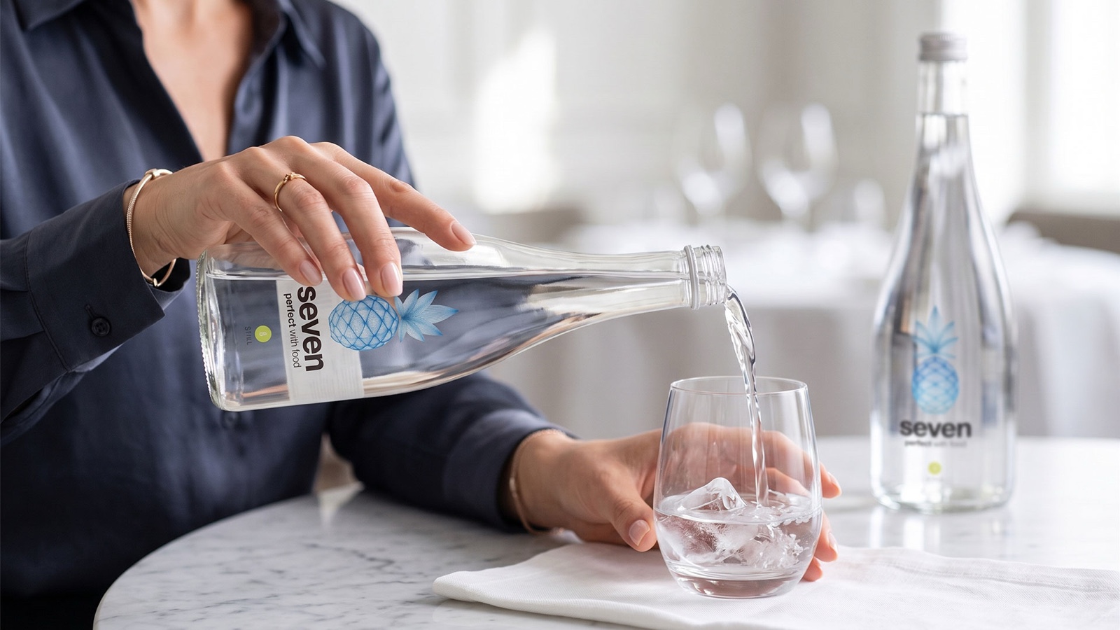
Seven
A new beverage based on the proteolytic enzyme bromelain which helps with digestion and is derived from pineapples. The beverage was not pineapple flavored but a hint of flavor- sparkling (line) or still (lemon)
- Branding
- Packaging
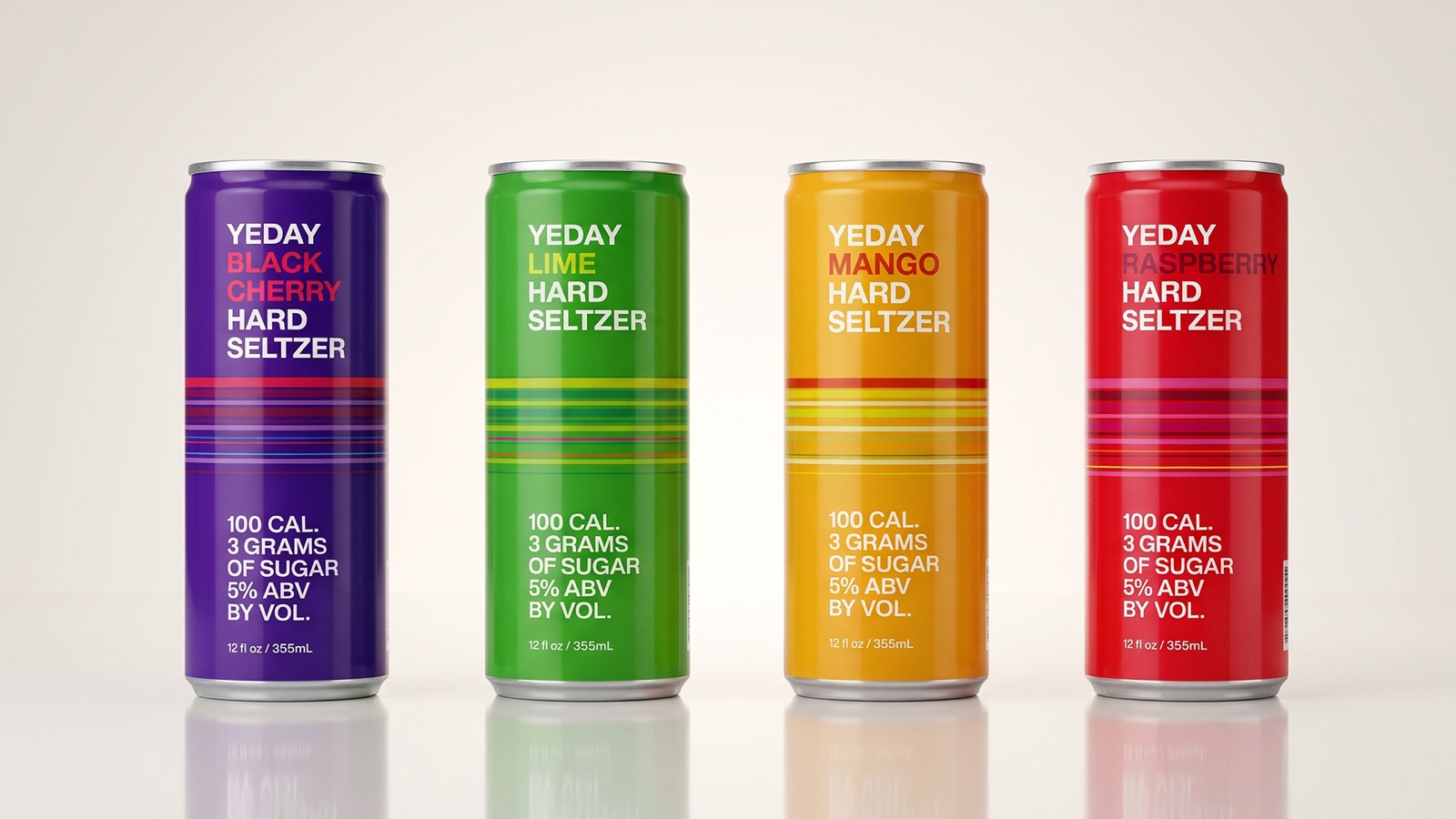
Yeday Hard Seltzer
Brand identity and packaging for Yeday hard seltzer — a colour-burst mark and a striped carton system that gives each of the twelve flavours its own palette.
- Branding
- Logo
- Packaging
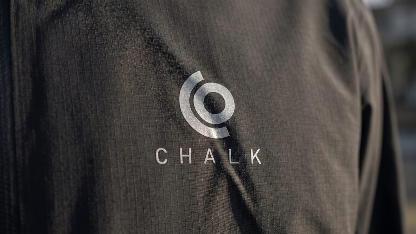
Chalk Outdoor
Expedition gear designed in West Cornwall CT.
- Branding
- Visual identity
- Web
Mayamaya
Premium travel brand whose name is Australian for Pelican.
- Branding
- Web
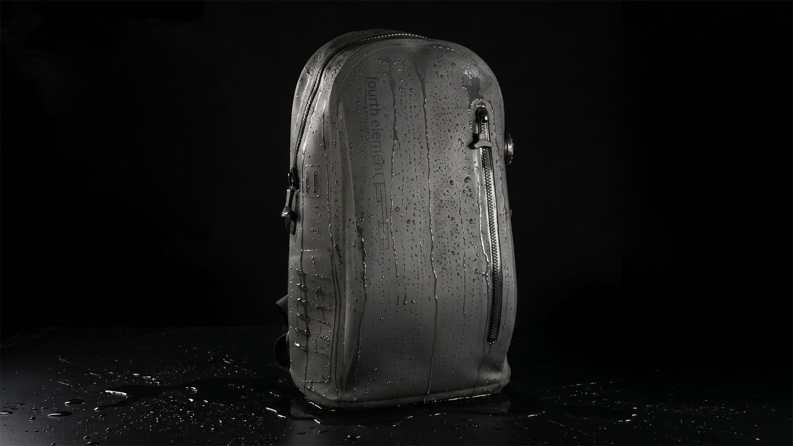
EP01 Backpack
A $600 submersible level waterproof backpack. Chalk CP designed all aspects starting from concept in conjunction with scuba company Fourth Element. Materials, welding and testing. Many features required new processes.
- Visual identity
- Type design
- Art direction
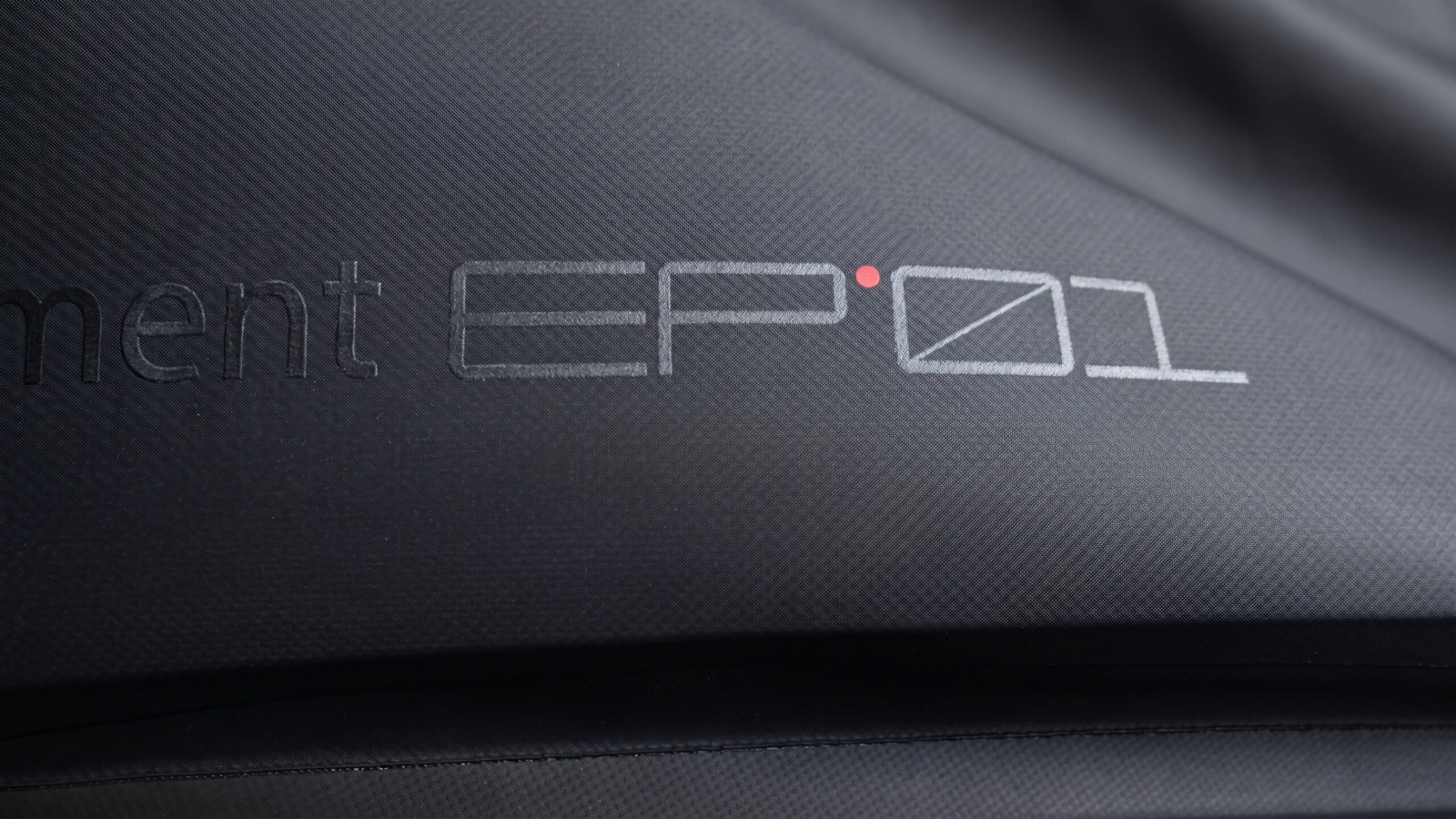
EP01 Font
New custom monospaced typeface designed for Chalk Outdoor x Fourth Element collaboration. Drawn for garments, gear and print, with full Latin Extended support.
- Type design
- Identity
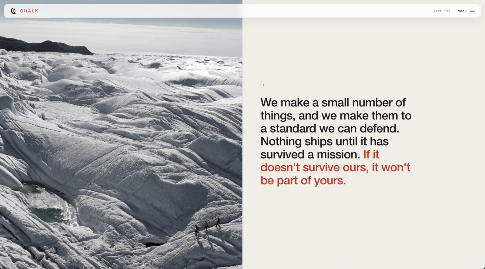
Chalk Outdoor Website
The Chalk Outdoor website — store, products, field-testing logs, weights & materials and an archive — designed and built to read like expedition documentation.
- Web design
- Web development
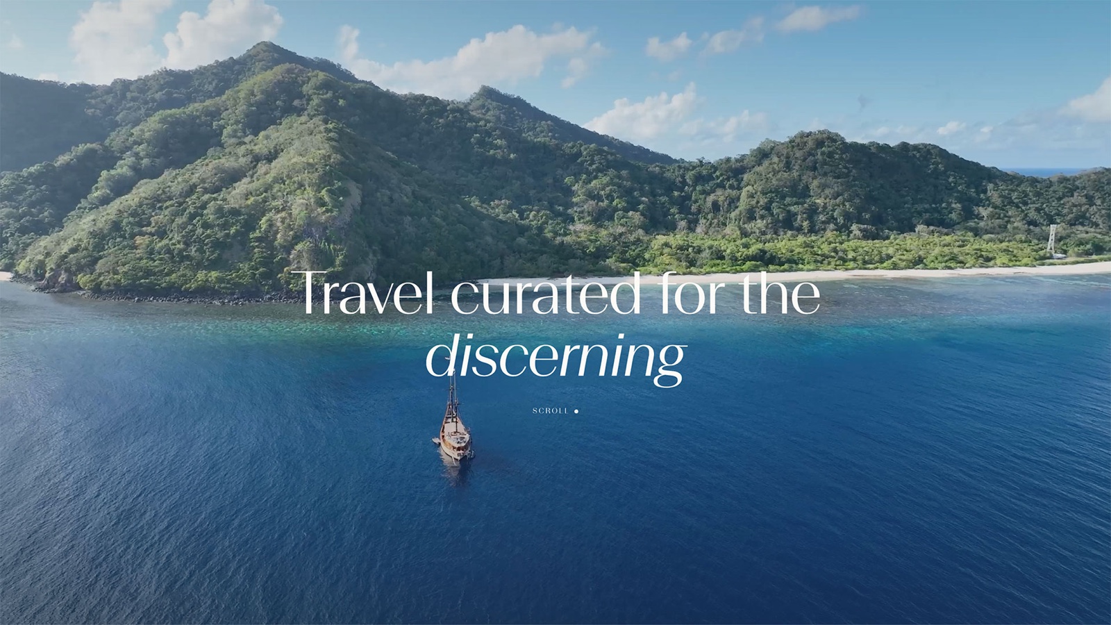
Odyssey
Identity for Odyssey Travel Design, a luxury travel advisor — a monogram of two mirrored arcs and a stem, drawn on a strict 45° construction and extended into a repeating pattern.
- Branding
- Logo
- Web design
EYOS Expeditions
Identity for EYOS Expeditions, who plan and lead expeditions by superyacht — a wordmark whose slashed O doubles as a compass, carried from business cards to crew kit and the yacht itself.
- Branding
- Logo
- Apparel

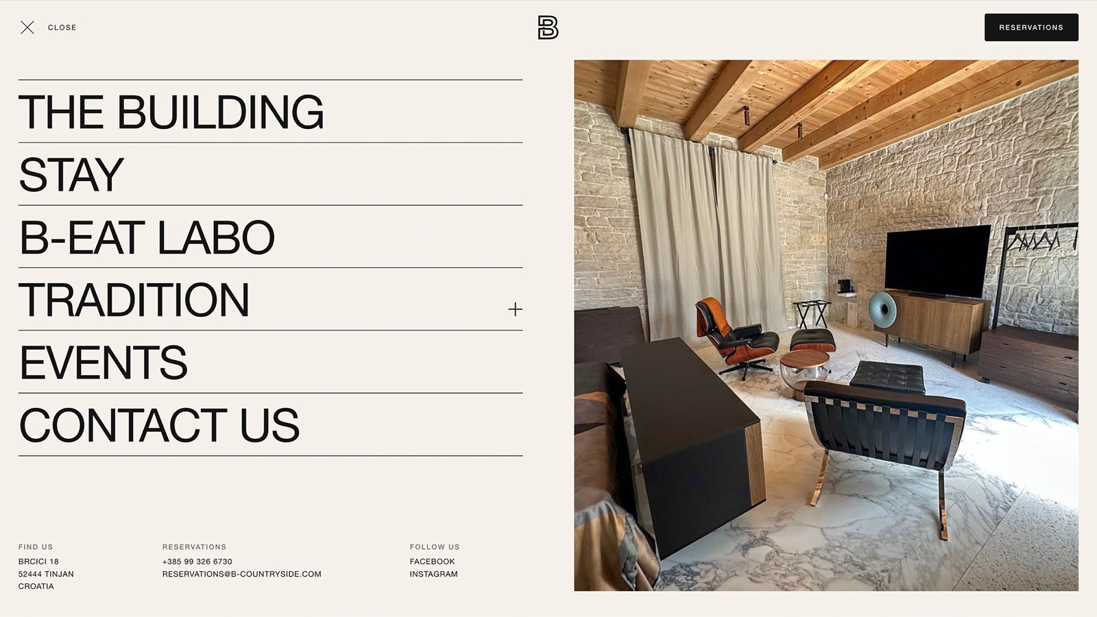
The B Website
Website for The B – Countryside, a luxury hotel in the Istrian countryside — an interactive masterplan of the estate, suite-by-suite details, the B-Eat Labo kitchen and a live weather footer.
- Web design
- Web development